
How to Compare Data Between the Two Editions of GDB?
In this blog post, we explore a critical question: How can we compare data between the first and second editions of the Global Data Barometer (GDB)?
On the Comparability page of our website, you’ll find an interactive table displaying each country’s score from the second edition, along with an icon indicating the direction of change – a green upward arrow for increases and a red downward arrow for decreases. (Note: These comparisons use adjusted scores from the first edition; more on this below.) By expanding a country’s national score, you can also view the score and direction of change for each indicator.
If you’d like to explore the data in more depth, we encourage you to download the full dataset from our open data page and run your own analysis.
But before diving into the numbers, it’s important to understand the key methodological changes between the two editions. These changes are critical for interpreting the comparability table accurately and responsibly. To support your analysis, we also propose two experimental approaches you can try when comparing results across editions.
Understanding Methodological Changes in GDB
In the second edition of GDB, we incorporated extensive feedback from stakeholders. Key changes include (please read our report and its annex for more details):
- Revised Composition and Weighting of Country Scores
A national GDB score is calculated as the weighted average of all indicator scores. The second edition reduced the number of primary Indicators from 39 to 27, altering the weight of each indicator. This structural change means direct linear comparisons between editions are impossible. - Changes to Indicator Content and Weighting
Each indicator’s score is determined by its existence questions (as a multiplier) and element questions (scored out of 100). The element score is derived from sub-questions standardized as Yes (1), Partially (0.5), or No (0), multiplied by their weights. Between editions, sub-questions were added/removed, weights were adjusted, or both occurred. Furthermore, the second edition updated the methodology for calculating the multiplier associated with existence questions, enforcing the multiplier to be within the [0.6,1] interval. Thus, score differences at the indicator level do not directly equate to performance changes—they require contextual interpretation based on methodological shifts. - Improved Response Processes and Standards
The extent question (assessing geographic coverage) is moved from the end of each indicator survey into the existence section as a flow stopper in the second edition. This means only frameworks/data with sufficiently representative coverage can proceed to the element section. In addition, we also standardise and raise the bar for what is accepted as valid evidence, so certain evidence is no longer accepted in the second edition to earn scores. These procedural and standard improvements further limit direct score comparisons between editions.
Behind the Curtain: How the Comparability Page Is Designed
Given these changes, displaying first edition scores or numerical score differences would mislead readers into interpreting score differences as direct performance changes. Here’s how we address it:
- Adjusted Country Scores:
We recalculated country scores of both editions by using only the 26 primary indicators common to both editions (the indicator ‘Governance (PP) Public procurement data’ is only covered by the second edition and excluded for calculation) and applying the second edition’s weighting scheme to each indicator. The adjusted scores at least enable the comparison between two editions based upon the same composition of indicators. - Labelling Change Direction:
A score difference (based upon adjusted country scores or indicator scores) exceeding ±1 triggers an arrow (green for increase, red for decrease). Differences within [-1, +1] are labeled as “no difference” to account for possible methodological noise. It is important to note that we strictly use the term “increase/decrease” rather than “improve/decline” because any score difference can not be directly interpreted as performance change without taking into account specific context.
When expanding a country’s score, you can see a list of indicator-level scores. Unlike country score, indicator scores allow direct cross-edition comparison to generate the change direction icon without any score re-calculations. However, we choose to not display score difference because any numerical values shall be only interpreted with essential information about methodological updates at the indicator level in the second edition, with some indicators having new/removed questions while others may have updated weight schemes.
Alternative Method to Compare Country Performance
One question you may have is why don’t we use standardised metrics such as Z-score to compare scores between editions? The decision stems from incompatibilities between editions’ score distributions as normality tests revealed. A 23% mean increase (27.98→34.44) and widened standard deviation (11.87→14.68) further reflect structural shifts. Comparing Z-scores between two editions could be misleading due to differing distribution parameters, as Z-scores are context-dependent within each group.
We instead introduce an experimental metric called Best Score Ratio. You probably already note in our report that we produced a Best Score (country score) based upon the highest scores of all indicators. The second edition’s Best Score is 88.24 (or 85.24 when excluding the indicator ‘Governance (PP) Public procurement data’), and the adjusted first edition’s Best Score is 83.64 ( including only second edition indicators and applying the second edition weight scheme).
We then can calculate the Best Score Ratio. It divides a country’s score by the Best Score, representing its progress toward the ideal scenario. For example: if Country A’s Best Score Ratio rises from 70% (first edition) to 75% (second edition), this 5% improvement reflects progress made between two editions. This metric allows numerical comparisons while sidestepping methodological inconsistencies.
Dive into Details: Unpacking Indicator-level Changes
To identify causes of indicator-level score changes without navigating and reviewing the entire raw survey data (you can find it on our open data page), we propose an experimental approach to examine shifts in answer distributions.
As previously explained, an indicator’s score is primarily determined by its element sub-questions, with a total possible score of 100 points. Each standardized question uses a three-tier response option (Yes: 1 point, Partially: 0.5 points, No: 0 points). The element score is calculated by summing each question’s score multiplied by its weight, though question weights may vary across different editions.
This reveals a fundamental principle: The Yes and Partially answers are the sole contributors to an indicator’s element score. There’s a positive correlation between their combined proportion in total answers and the indicator’s element score – higher proportions correspond to higher scores (Note the only exception is negative scoring questions whose Yes and Partially answer decrease the element score and therefore require inverse proportional calculation). Conversely, higher proportions of No answers correlate with lower indicator’s element score. Therefore, when comparing the same indicator for the same country across two editions, analyzing the proportional changes in Yes, Partially, and No answers can help quickly understand the direction of score changes.
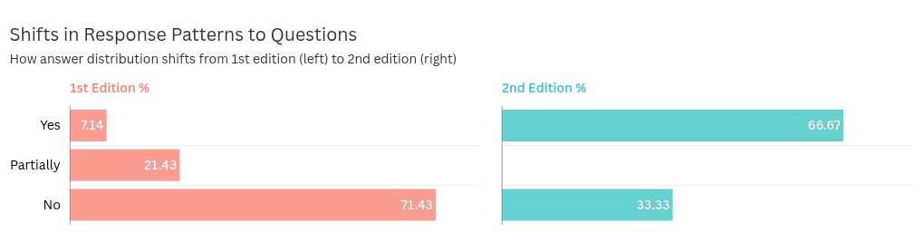
For example, the chart shows Ecuador’s ‘Capability (C): Government support for re-use’ indicator: In the first edition (the left one), ‘No’ answers (in red) dominated at 71%, while in the second edition (right), ‘No’ answers decreased to 33%. Simultaneously, ‘Yes’answers (in green) increased from 7% to 67%. This clearly suggests a score improvement in the second edition.
This method proves particularly effective when correlating answer proportion shifts with element score changes across editions (noting that final indicator scores remain subject to multiplier adjustments). A key interpretive pattern emerges: substantial proportional changes in answers coupled with minimal element score variation typically suggest answer changes occurred primarily in lower-weight questions, whereas modest response shifts paired with significant score fluctuations likely point to modifications in higher-weight critical questions. This diagnostic relationship enables rapid prioritization of indicators requiring deeper investigation.
Final Remarks
In concluding this blog, we reiterate a crucial principle for interpreting GDB data across editions: meaningful comparisons must be grounded in an understanding of the methodological changes and enriched by relevant qualitative insights. We encourage readers to consult the full report for detailed methodological documentation and to explore the complete Barometer dataset on our open data page, where they can experiment with different approaches to comparing and interpreting results across editions.