
Announcing the Winners of the Global Data Barometer Data Visualization Challenge
We are thrilled to share the results of the 2025 Global Data Barometer Data Visualization Challenge!
Over the past few weeks, participants from around the world explored our data and crafted powerful, creative visualizations that help us better understand critical issues affecting the Global South. From interactive dashboards to storytelling-infused infographics, submissions showcased an impressive diversity of formats, skills, and insights.
Our panel of six expert judges reviewed dozens of entries, evaluating each submission for clarity, innovation, design, and how effectively it used data from the Global Data Barometer’s 2nd edition.
After careful deliberation, we are proud to announce the winners of the 2025 GDB Data Visualization Challenge.
🥇 1st Place
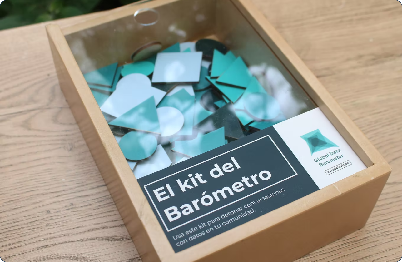
Barometer Dataviz Kit: Playing in community to spark conversations about data openness in neighborhoods
Author: Jose Duarte
A playful and participatory toolkit designed to engage communities in conversations about data openness using the GDB dataset.
Why we loved it: This submission stood out for its creative and participatory approach, transforming the Global Data Barometer into a tangible, community-centered experience. By using simple shapes and analog tools, it makes complex data approachable and sparks inclusive conversations about openness in neighborhoods. Though not a traditional digital visualization, its originality, clarity, and potential for real-world impact impressed the judges.
🥈 2nd Place
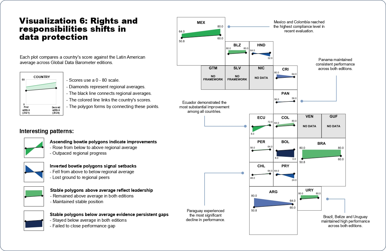
Tracing the evolution of data protection in Latin America according to the Global Data Barometer 2024
Authors: David Martínez Galicia, Eidan Enrique Juárez García and Dalia Abigail Uscanga Gutiérrez
An insightful and well-researched exploration of the development of data protection policies across Latin America.
Why we loved it: This project stood out for its impressive depth of analysis and thoughtful use of Global Data Barometer data, offering a compelling regional deep dive into data protection frameworks. Judges appreciated the originality of the use of alluvial diagrams and symbol tiles to make complex information more accessible. This entry was considered one of the most insightful submissions overall.
Special Mentions
✏️ Outstanding Visual Design:
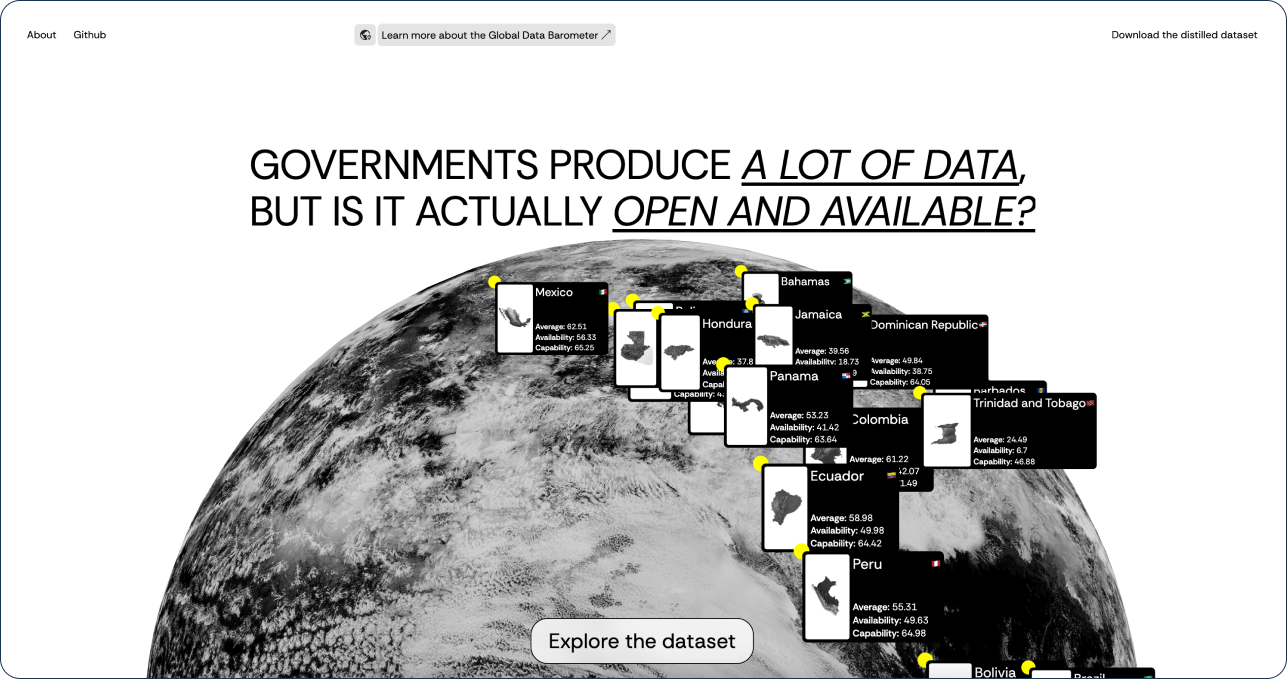
Exploring and sharing GDB 2024 Dataset
Author: Tommaso Prinetti
A beautifully designed platform to navigate the Global Data Barometer dataset.
Why we loved it: This beautifully designed and easy-to-navigate dashboard provides an excellent gateway into the GDB data, making it approachable and intuitive for a wide range of users. Judges praised its clean layout, consistent color palette, and clever use of visuals. It was celebrated for its elegance, clarity, and strong visual identity.
🧩 Best Dashboard Development
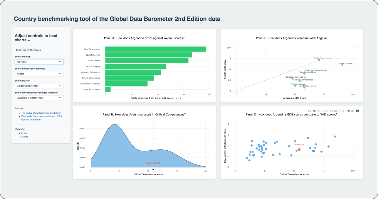
Country benchmarking tool of the Global Data Barometer 2nd Edition data
Author: Alexis Rivera Ballesteros
An intuitive and powerful dashboard for comparing country-level data from the GDB.
Why we loved it:This highly practical and well-executed dashboard enables users to benchmark GDB scores across countries, making complex comparisons easy and engaging. Judges appreciated the intuitive controls, strong data accuracy, and the addition of external indicators like the World Bank’s governance data, which added valuable context. The dashboard was praised for its usefulness, offering a powerful tool to support deeper exploration and understanding of the GDB results.
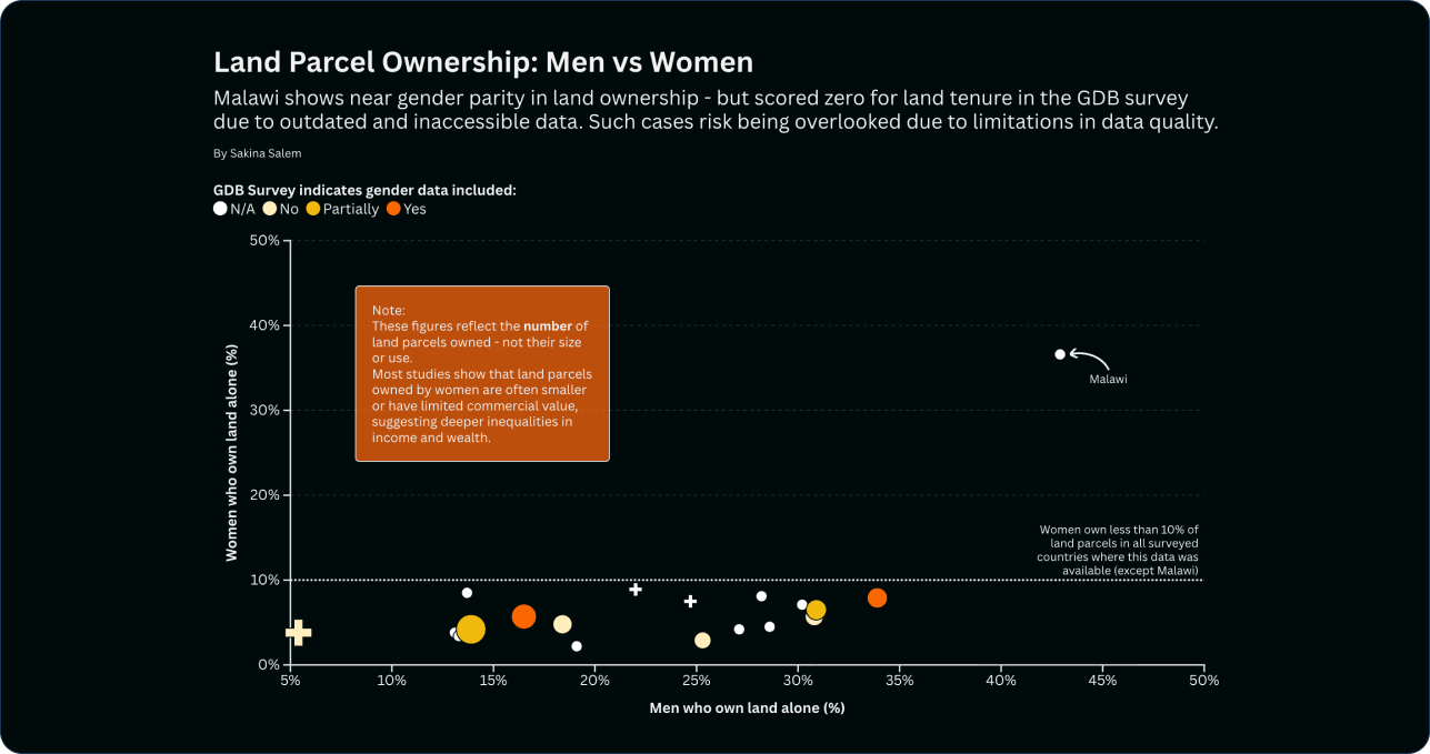
🌎 Best Use of Data for Inclusion:
Gender Inclusion in Land Tenure Data
Author: Sakina Salem
This project shines a light on gender disparities in land tenure through clear, effective visual storytelling.
Why we loved it: By highlighting a critical yet often underexplored topic, this visualization brings new perspectives to the GDB data through a gender lens. The judges valued its originality, meaningful topic selection, and creative integration of external data, which opened up new conversations around inclusion and representation.
Other Shortlisted Projects
In addition to the winning and honorable mention entries, several other outstanding submissions were shortlisted for their creativity, thoughtful use of data, and potential to engage diverse audiences. We are grateful for the effort and talent behind each of these visualizations:
- State of Open Data in the Global South by Jazmín Bazán
- GDB Report: Second Edition by Michelle Reyes Agüero
- Data Storytelling: a Brief Tutorial Using the Global Data Barometer 2025 By Dagoberto José Herrera Murillo
- When AI Meets Open Data: A Data Story By Jésica Edith Tapia Reyes
- Corruption and Transparency Dashboard By Shadrack Kirui
- Two Regions, Two Realities: Critical Competencies in Data Ecosystems By Nolwazi Nozipho Nonkululeko Ntini
- Constructor S-57: GDB Interactive Visualization By Steven De Costa
We deeply appreciate every participant who took the time to explore the GDB data and turn it into something meaningful. Your creativity and commitment continue to inspire our community!